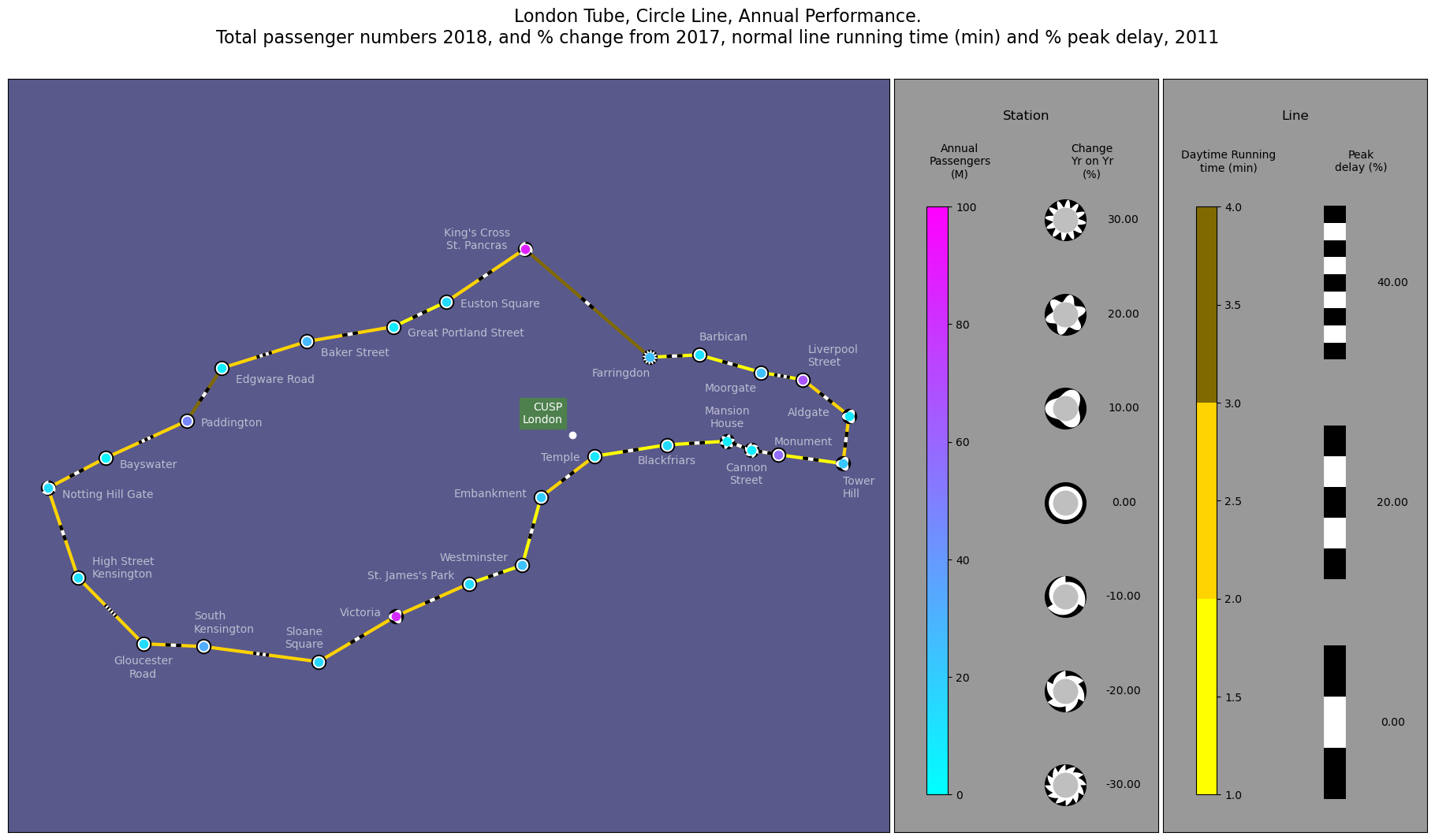
Glyphs and edges of the London Underground#
Station passenger volume change 2017 - 2018 Line segment running time and percentage change (slow down) at peak times 2011 data.
Powered by TfL Open Data Contains OS data © Crown copyright and database rights 2016’ and Geomni UK Map data © and database rights [2019]
Nick Holliman, @binocularity, September 2023
[ ]:
import pandas as pd
import matplotlib.pyplot as plt
from matplotlib.colors import ListedColormap
import numpy as np
from PIL import ImageColor
from vizent import create_plot, add_glyphs, add_lines

# Flag to draw station name labels on the plot.
drawStationLabels = True

# Circle line RGB colour from the TfL hexcode.
# Calculate a derived three colour scale for the line speed.
rgbColraw = (ImageColor.getcolor("#FFD300", "RGB"))
rgbCol = tuple(ti/255 for ti in rgbColraw)
centralLineCol = tuple(ti/255 for ti in rgbColraw)
cmapPlain = ListedColormap([ tuple(np.clip(ti*2,0.0,1.0) for ti in centralLineCol),
                            centralLineCol,
                            tuple(ti/2 for ti in centralLineCol) ])

# Read in csv table holding the node locations and data
# Use the UK national grid Eastings and Northings location data.
dfNodes = pd.read_csv ('sample-data/circle-line-tubeNodesZ1L3PsgrCnghPcnt1718GB.csv')
N_Vals = dfNodes["northing"]
E_Vals = dfNodes["easting"]
pcntVals = dfNodes["AnnEntExPcnt2017"]
pcntChng1718Vals = dfNodes["AnnEntExChngPcnt1718"]
passngrNum2018 = dfNodes["AnnEntEx2018"]
passngrNum2018_M = dfNodes["AnnEntEx2018"]/1000000

# Load the edge connectivity table with the edge data on journey times.
dfEdges = pd.read_csv ('sample-data/circle-line-edgesZ1L3_withTime.csv')
startPts = []
endPts = []
for i, edge in dfEdges.iterrows() :
    startPts.append([E_Vals[edge["s1"]-1], N_Vals[edge["s1"]-1] ])
    endPts.append([E_Vals[edge["s2"]-1], N_Vals[edge["s2"]-1] ])

# Create a Vizent plot
vizent_fig = create_plot(use_glyphs=True,
                         use_lines=True,
                         show_legend=True,
                         show_axes=True,
                         use_cartopy=False,
                         scale_x=20,
                         scale_y=11.25)

# Add glyphs to the plot (graph nodes)
add_glyphs( ax=vizent_fig,
            x_values=E_Vals,
            y_values=N_Vals,
            colormap = "cool",
            color_values=passngrNum2018_M,
            color_min = 0.0,
            color_max = 100.0,
            shape_values=pcntChng1718Vals,
            shape_min = -30,
            shape_max = 30.0,
            shape_neg = "saw",
            shape_n = 4,
            size_values=[14 for i in range(27)],
            legend_title = "Station",
            color_label = "Annual\nPassengers\n(M)",
            shape_label = "Change\nYr on Yr\n(%)",
            label_fontsize=10
)

# Add edges to the plot.
add_lines(
    ax = vizent_fig,

    x_starts=[i[0] for i in startPts],
    y_starts=[i[1] for i in startPts],

    x_ends=[i[0] for i in endPts],
    y_ends=[i[1] for i in endPts],

    freq_values=dfEdges["slowerPcnt"],
    width_values=[3 for i in range(27)],
    freq_min = 0.0,
    freq_max = 40.0,
    freq_n = 3,

    color_values=dfEdges["Inter peak (1000 - 1600) Running time (mins)"],
    colormap=cmapPlain,
    color_min=1.0,
    color_max=4.0,
    style = "set_length",
    length_type = 'pixels',
    striped_length =20,
    # length_type = 'units',
    # striped_length =200,

    legend_title = "Line",
    color_label = "Daytime Running\ntime (min)",
    frequency_label = "Peak\ndelay (%)",

    label_fontsize=10
)

# Select correct subfigure to overplot with station names
fig = vizent_fig[0]
ax = vizent_fig[1]

# CUSP London location (at Bush House)
ECUSP = 530736
NCUSP = 181042
ax.plot(ECUSP, NCUSP, 'o',markerfacecolor="w",markeredgecolor="w")
ax.text(ECUSP-100.00, NCUSP+125.00, 'CUSP\nLondon', color='w', fontsize = 10,
                 horizontalalignment='right',
                 bbox={'facecolor': (0.3,0.5,0.3),'edgecolor':(0.3,0.5,0.3),  'pad': 3})

#Draw the station names if flag for text is True
if drawStationLabels :
    dfNames = pd.read_csv ('sample-data/circle-line-tubeNodesZ1L3NamesLocsGB.csv')
    for i,row in dfNames.iterrows() :
        lonNm = row["easting"] + row["adjEast"]
        latNm = row["northing"] + row["adjNorth"]
        curName = row["name"]
        curName = curName.replace(r'\n', '\n')
        ax.text(lonNm, latNm, curName, color='w', fontsize = 10, alpha=0.6,
                        horizontalalignment=row["ha"])

# Adjust the plot aesthetics.
fig.axes[2].set_facecolor((0.35,0.35,0.55))
fig.axes[1].set_facecolor('0.6')
fig.axes[0].set_facecolor('0.6')

plt.suptitle("London Tube, Circle Line, Annual Performance.\n"+
             "Total passenger numbers 2018, and % change from 2017,"+" normal line running time (min) and % peak delay, 2011",
               fontsize=16)


# When saving this image, a DPI of 192 generates a file of 3,840 x 2,160 pixels (i.e. UHD quality).
# This can be done with the following lines:
# fileDPI = 192
# plt.savefig( fileName, dpi=fileDPI )
C:\Users\k2364528\Code\vizent\vizent\scales.py:230: UserWarning: Specified minimum and maximum shape scale values or specified shape scale spread exclude some data
  warnings.warn("Specified minimum and maximum shape scale values "
Text(0.5, 0.98, 'London Tube, Circle Line, Annual Performance.\nTotal passenger numbers 2018, and % change from 2017, normal line running time (min) and % peak delay, 2011')